Historical Style Logo
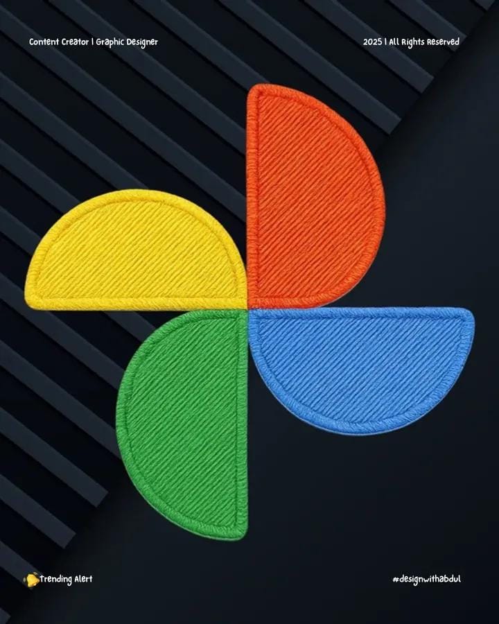
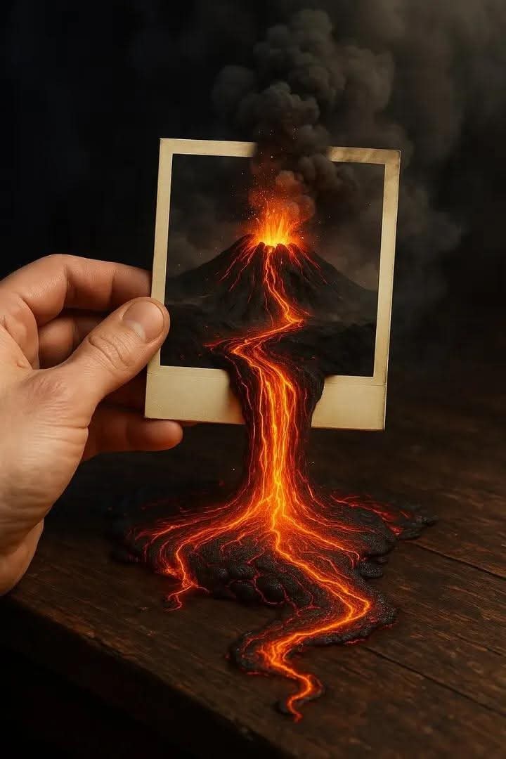
Generated Images
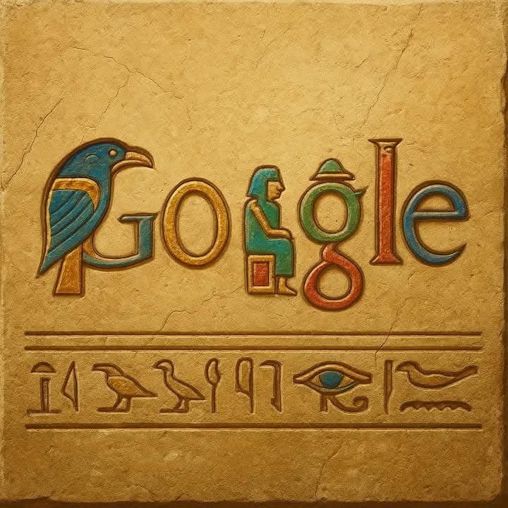

The Prompt
Here’s the prompt I used to create these images: Create a highly detailed reimagining of the [BRAND NAME] logo in the style of [ERA / ART STYLE]. It should look as if the logo was originally designed in that time, with authentic textures, materials, and colors. Make it visually striking, realistic, and era-accurat, for example: carved stone, oil painting, neon lights, holograms, etc. Keep the logo recognizable but transformed by the style.
How to Use
To use this prompt professionally, utilize it for historical logo redesigns, era-specific branding, or artistic transformations in design education. Preserve "highly detailed reimagining," "[BRAND NAME] logo," "style of [ERA / ART STYLE]," and "era-accurate" for authenticity. Do not change the recognizable form or visual motifs. Replacing era with "Victorian" could yield ornate visuals, leading to textured materials, while original creates striking, realistic outcomes.
Prompt Variations
1. 1. Ancient Egyptian Hieroglyphic Cartouche
This variation transforms the brand logo into a carved and painted ancient Egyptian cartouche. Best for brands wanting to convey history, mystery, and timeless craftsmanship.
Create a highly detailed reimagining of the [BRAND NAME] logo as an authentic ancient Egyptian cartouche. It should look as if the logo was originally designed in that time, carved into sun-bleached limestone and painted with faded mineral-based pigments (ochre, lapis lazuli blue, malachite green, and gold leaf). The logo's elements are reinterpreted as stylized hieroglyphs and symbolic figures within the oval cartouche shape. The stone surface shows realistic weathering, chips, and patina from millennia. Surrounding the cartouche are subtle carved reliefs of Egyptian motifs like lotus flowers or scarabs. Lighting is soft, directional raking light that emphasizes the depth of the carvings. Ultra-realistic, macro detail of textures, 8K. Aspect ratio 9:16.
2. 2. Renaissance Oil Painting on Wood Panel
This variation renders the logo as a detailed oil painting on aged wood, mimicking the style of a 15th-century Renaissance master. Perfect for luxury, classic, or artistic brands.
Create a highly detailed reimagining of the [BRAND NAME] logo as a Renaissance-era oil painting on a aged oak panel. It should look as if the logo was originally designed in that time, with visible brushstrokes, craquelure (fine cracks) in the paint, and a rich, warm varnish. The logo is rendered with chiaroscuro lighting, appearing as a central emblem or crest within a larger composition, perhaps held by putti or surrounded by floral motifs typical of the period. The color palette is deep and warm, featuring rich reds, golds, and umbers. The wood panel has realistic wear, with slight warping and loss of paint at the edges. Ultra-realistic, 8K, museum-quality detail, dramatic studio lighting. Aspect ratio 9:16.
3. 3. Art Deco Chrome and Enamel Sign
This variation reimagines the logo as a polished chrome and enamel sign from the 1920s Art Deco era. Ideal for brands evoking vintage glamour, luxury, and geometric sophistication.
Create a highly detailed reimagining of the [BRAND NAME] logo as a three-dimensional sign in the Art Deco style. It should look as if the logo was originally designed in the 1920s, crafted from highly polished chrome and inlaid with vibrant, glossy enamel in bold colors like jade green, black, and ruby red. The logo's design is stylized with strong geometric lines, sunburst motifs, and stepped forms. The metal has a mirror-like finish with realistic reflections and slight patina at the edges. The enamel sections are smooth and glossy, with a sense of depth. Lighting is dramatic, with bright highlights on the chrome and clean reflections. Photorealistic, 8K, macro detail of materials. Aspect ratio 9:16.
4. 4. Soviet Era Industrial Mosaic
This variation portrays the logo as a monumental, weathered mosaic from the mid-20th century Soviet era. Perfect for brands with a gritty, Brutalist, or historically complex aesthetic.
Create a highly detailed reimagining of the [BRAND NAME] logo as a large-scale, weathered mosaic in the style of Soviet-era monumental art. It should look as if the logo was originally designed in the 1960s, constructed from thousands of imperfect, small glass and stone tesserae. The logo is integrated into a larger geometric or heroic figurative panel. The mosaic shows realistic age: missing tiles, cracks, efflorescence, and dirt accumulation in the grout lines. The color palette is bold but faded, featuring deep reds, ambers, grays, and off-whites. Lighting is flat and overcast, emphasizing the texture and wear. Ultra-realistic, 8K, hyper-detailed texture of tiles and decay. Aspect ratio 9:16.
5. 5. Steampunk Engraved Brass and Copper
This variation presents the logo as an intricate Victorian-era brass and copper plate, complete with gears and mechanical elements. Great for brands focused on innovation, craftsmanship, or a retro-futuristic vibe.
Create a highly detailed reimagining of the [BRAND NAME] logo as an intricately engraved brass and copper plate in the Victorian Steampunk style. It should look as if the logo was originally designed for a fantastical 19th-century machine. The logo is the centerpiece of a larger mechanical assembly, with decorative gears, rivets, and pressure gauges integrated into its design. The metal surfaces are a mix of polished and oxidized areas, with realistic patina, tarnish, and fine tool marks from engraving. The logo is raised or recessed with deep, precise line work. Lighting is warm and directional, creating deep shadows in the engravings and highlighting the metallic luster. Photorealistic, 8K, macro detail of metal textures. Aspect ratio 9:16.
6. 6. Neon Sign on a Rainy Night
This variation reimagines the logo as a glowing neon sign, reflected in the wet pavement of a city street at night. Ideal for a vibrant, modern, or nocturnal brand identity.
Create a highly detailed reimagining of the [BRAND NAME] logo as a classic bent-glass neon sign. It should look as if the logo was originally designed for a mid-20th century storefront. The sign is mounted on a dark, weathered brick wall, with the glass tubes glowing brightly in a rich, vibrant color (e.g., electric blue, hot pink, or argon red). The scene is set at night after a rain shower, with the neon light reflecting and blurring in the wet pavement below. Glass insulators and rusted metal fixtures are visible. The background is a dark, moody city street with soft bokeh lights. Lighting is from the neon itself, creating colorful pools of light and deep shadows. Photorealistic, 8K, cinematic, atmospheric. Aspect ratio 9:16.
7. 7. Holographic Projection in a Dark Space
This variation depicts the logo as a futuristic, flickering hologram projected in a dark, tech-infused space. Perfect for cutting-edge, digital, or sci-fi oriented brands.
Create a highly detailed reimagining of the [BRAND NAME] logo as a volumetric, flickering holographic projection in a dark, minimalist space. It should look like cutting-edge, slightly unstable future technology. The logo is rendered in translucent, glowing light with a subtle rainbow iridescence and visible scan lines or pixelation at its edges. It appears to float in mid-air, casting a faint colored glow on the dark metallic floor below. Tiny particles of dust or data motes float through the light beam. The background is a dim, high-tech environment with subtle reflections in dark glass or polished metal. Lighting is solely from the hologram, creating a moody, high-tech atmosphere. Photorealistic, 8K, intricate light and particle effects. Aspect ratio 9:16.
FAQ
- What is the core task of this prompt?To reimagine a brand logo in the style of a specific era or art style, making it look authentically designed in that time.
- What are some example transformations mentioned?To reimagine a brand logo in the style of a specific era or art style, making it look authentically designed in that time.
Related Prompts